Thursday, April 27, 2017

Dewey want to Seymour Learning? It's not Godin be easy

PART 1


Does this ring a bell?

"The subject-matter of education consists of bodies of information and of skills that have been worked out in the past; therefore, the chief business of the school is to transmit them to the new generation"


This is how John Dewey (Experience and Education, p17) characterised the traditional model of schools.

In my experience, the situation has not progressed very far in the eighty years since Dewey was writing. As a teacher in the 'university-preparation' stage of an international secondary schooI, I have spent most of my time in classrooms upholding this model for which:

"the attitude of pupils must, upon the whole, be one of docility, receptivity and obedience". (p18)


The goals are fixed (we make common cause with students, parents and administrators to attain the highest scores in public examinations). We do not ask whether the examining body's criteria benefit the student, we simply train her to jump through the hoops.

Dewey then contrasted tradition with 'certain common principles' of 'new education' which are:

"cultivation of individuality ... learning through experience ... acquisition of [skills] as means of attaining ends which make direct vital appeal ... making the most of the opportunities of present life ... acquaintance with a changing world." (p19)


That description of an education will appeal to many people who read it, but since we appear to be powerless to change the goal, the means we employ to achieve it also remain largely the same as before.

PART 2


Project-based learning is inspired by Dewey's philosophy of education as a social activity. The differences between Project/Challenge/Problem based learning methods are not really significant; their similarities are the important issue. Each of them helps students to:

learn about Real-world issues


"students are pulled through the curriculum by a Driving Question or authentic problem that creates a need to know the material" (Introduction to Project Based Learning, Buck Institute of Education)


Reflect on how and what they are learning


"Judge it by what the whole system learns, and that includes the teacher." (Interview with Seymour Papert)


choose how they learn


"Emphasise student independence and inquiry" (John Larmer on Edutopia)


Sustain Focus on a topic


"Challenge Based Learning slows down the experience to allow for full participation, ongoing reflection, and self-discovery." (CBL and personalized learning, digitalpromise.org)


PART 3


But it is easy to say what is wrong with an institution; much more difficult is actually to bring about change for the better. Generations of educators have nodded along with John Dewey but, unlike most areas of society in which change has been rapid, very little progress has been made. I think this is because we are prematurely congratulating ourselves on seeing the problem, not realising that it is only the first small step in a journey with no map.

Dewey knew this:

"The general philosophy of the new education may be sound, and yet the difference in abstract principles will not decide the way in which the moral and intellectual preference involved shall be worked out in practice". (p20)


In other words, can we set some new goals? If we don't (and usually, in schools, we try to skip this most difficult step), then the change we say we want will not occur. We have people like Dewey and Papert to help us, but we must listen and let them teach us to think deeply about the reasons for what we are doing.

PART 4


Something has to give. There are only so many hours in a student's career. If you're going to do a new thing, you have to retire an old thing.

"The trend towards portfolio-based, so-called authentic assessment is very good, but it's very limited unless it goes with throwing out the content of what we're testing." (Seymour Papert)


If you've ever seen a conversation between teaching subject-specialists as they try to identify content to throw out, you'll know how hard this will be. Yet it has to happen.

Furthermore, let's not kid ourselves that projects will be easier to implement. On the contrary:

"we're going to have to work very hard to make the stuff that they're going to learn. It's not going to come about just by teaching the old stuff in a more, "constructivist" way." (Papert)


PART 5


So, like our students, we have to read; we have to work hard.

And we have to think and learn.

"Please ask someone, “what is school for?” and don’t stop asking until we can agree on the answer and start taking action" (Seth Godin in Stop Stealing Dreams)


You can read Dewey's answer in Article 2 here.

This is what my family said (and no-one mentioned exams):

  • School replaces human nature with more society-friendly characteristics (in his 20s)

  • School is there to prepare you for adult life. And I'm not sure it does that for our lot... (50s)

  • I think school is there to teach children to read, so that they can go out and choose their reading, whether it be fiction or non-fiction, freely and independently. (50s)

  • School gives children their first opportunity to live in a society away from their home surroundings and to build relationships beyond the family. (70s)


What do you think school is for?

Monday, April 10, 2017

Learning 2 integrate technology

makering croppedImagine going to an educational conference where, although technology is central, in many sessions it is not even mentioned because everyone is too busy talking about teaching and learning.


Imagine every presenter being a current educator (or student!), in touch with the concerns of their audience.


Imagine that there is no celebrity keynote speaker, nor any outsider delivering plenary talks; just those aforementioned practitioners.


Imagine a style of session in which the presenters have the freedom to give you, say, half an hour to just try stuff out or chat or read or whatever is right for you.


For a lot of teachers, that is the PD they wish they were getting.


I'm in Poland and the Learning2 Europe conference at the American School of Warsaw has just finished.

On Thursday, I signed up for Maker Your Own Learning. Right from the start, Mark and Sarah told us they wouldn't be giving much direct instruction. As a result I was a bit stuck. So I found a template to make a simple circuit on a piece of paper. I didn't know why I was doing it. But it worked, and now I could see some possibilities. The beauty is that I'd had to figure them out for myself. The final version can be seen in Sarah's tweet below. My polychromatically luminous badge is not exactly an innovative form of 21st century communications technology, but I am proud because four days later, despite much handling, it still works perfectly.

For the rest, I had a very CoETaIL time. The other sessions over the weekend I attended were with graduates Nicki HambletonSonya TerBorg and Diana Beabout. Each time, technology was never far away, but it was integrated, in the words of Mary Beth Hertz, seamlessly.

"Students use technology to learn content and show their understanding of content, not just their expertise with a tool." (Hertz)


That, of course, is what technology integration should always be. I have been wondering how often my lessons look like that. I teach two widely differing classes: Grade 11 ToK (an externally assessed IB Diploma course) and Grade 6 Get Set (an introduction to the 1-to-1 classroom). My colleague Becky and I also run #islconnects (a series of workshops for teachers).

During Unit 1 of this course, I wrote a blogpost (WAY OF THE SAMR EYE) comparing the common models for evaluating tech integration.

SAMR (not my favourite);


TPACK (which I've used the least);


and PATER (which is least well-known but, being a cycle, the most effective to use, in my view).


Here are some learning activities involving technology which I have recently taught. I shall consider them with a TPACK eye.

Ancient Civilisation Facebook profile (bit.ly/islfacebooktemplate)


We use a facebook profile to highlight some facts about a historical figure. Aside from the factual content (which our Social Studies colleagues handled), we wanted the students to gain experience with technology: online search and citation; shared Google Drawings (the template); and simple photo-editing (the profile picture). Pedagogically, it was a challenge to manage the students juggling several tools at once while maintaining focus on the learning of history. Ideally, the students would have more choice of tool and their research questions, but we concluded that the restriction would serve our goals.

Knowledge Question Film Festival (bit.ly/tokkqff)


In a one hour lesson, we watch a playlist of clips, one chosen by each student to exemplify, as content, the sort of knowledge question ToK is interested in. The students reflected on the questions in an online back-channel. The discussion was too distracting: a victim of my desire to incorporate technology at all costs. Next time, the students will reflect alone and compare notes later. Pedagogically, a paper-based See Think Wonder would have been more appropriate.

The Power and the Point - of documents in the cloud (bit.ly/powerandpoint)


This activity has been through a number of iterations, each time giving the attendees more time to use technology to try things out. It remains a content-heavy session which is delivered largely from the front. Pedagogically, I would like to keep contact with the teachers while they implement what they have learned in their upcoming lessons.

L2-Warsaw-Poster2After a foray into the upper echelons of administration, I returned to the classroom around ten years ago and was excited by the obvious possibilities inherent in educational technology. Like many other colleagues, I have consciously tried to find as many different ways as possible to integrate technology. We sometimes make mistakes and go too far. Usually, the first people to notice this failure are our students.


New ways of teaching and learning will need new ways of developing professionally in supportive and flexible models with transparent and flat organisations. I hope many teachers consider attending a Learning2 in the near future, in November in Shanghai...


...or in March 2018, I hope we can welcome you to Luxembourg is Learning2.


Friday, March 3, 2017

Learn design theory - then follow your heart

It's so easy to create your own new blog or website: a handful of clicks to give it a cool name, choose a groovy template, create some pages or posts and suddenly you are an author publishing on the web. I've done it many times, but I sometimes later regret my initial aesthetic decisions. Maybe I went with the defaults and my blog looks too much like all of the others; alternatively, perhaps I threw together a palette of colours which I later feel doesn't marry with the message I want my audience to take away.

[caption id="attachment_153" align="alignright" width="300"]KA_homepage_March_1st_2017 The blog before I changed it[/caption]

In a previous post, I described how I initially decided on the look for my Knower's Arc blog. Now everything has to change: function, layout, appearance and content. It's nice when you get it right at the start (which I didn't). Otherwise you need to intervene and fix it. Here goes.

a new function


There are two ways in which I generate material for my Theory of Knowledge course: I create online slideshows to support the teaching and I collect online stimuli to inspire student presentations. I would like to curate all of these materials in one place. Thus, the blog needs to acquire pages where my resources will live.

[caption id="attachment_154" align="alignleft" width="300"]KA_layout_change_2_March Now it's a blogsite[/caption]

a new layout


I considered a few alternatives (Google sites, Wordpress, Weebly, Wix, Wikispaces, Squarespace...) but eventually decided to stay put on Blogger rather than re-build the site from scratch. Beside the existing blog and tag cloud, I have created pages to house resources for each of the main topics (about 20). It's pretty text heavy, but that seemed to me the most efficient way for all of the links to be on the homepage. The categories are based on the course organisation which all of its users understand. You can't tell, maybe, but there were many versions of the layout before I arrived at this which works best for me. I also changed the picture but I couldn't say why I chose the new one. It looked right.

a new appearance


[caption id="attachment_155" align="alignright" width="300"]Goethe wheel Goethe's wheel connects colour and emotion[/caption]

Leonardo, Newton and Goethe all had theories which expressed their beliefs about what colour is and the emotion it evokes. They did not agree. None of them knew anything about hexadecimal colour codes which reduce all colour to a logical system understood by websites. Nonetheless, it is generally agreed by modern designers that colour and emotion are related. Do all cultures react the same way to colours though? Some research suggests not. So maybe someone's colour theory tells us more about the person than about colour itself. If you're going to break the rules, though, it's better to know them.

My first colour scheme combined colours from van Gogh's paintings. I suppose I thought that one of art's great aesthetic sensibilities couldn't be wrong, but why should that work for an entirely different purpose? Time to try something different. I'm not going to use someone else's palette. I'll make my own.

[caption id="attachment_156" align="alignright" width="300"]palleton_wheel_001 Paletton.com's wheel is based on logic[/caption]

Paletton.com is an amazing free tool. This is my chance to play with it. I used it to make some themes.

  1. Monochromatic blue based on a tone in the banner photo which I sampled with the excellent ColorZilla Chrome extension.

  2. Triad yellow based on van Gogh's sunflowers + two adjacent colours chosen by eye).

  3. Triad purple based on the colour of my Physics website + two distant colours chosen by eye.

  4. Tetrad of colours separated by Golden Ratio.


Flick through the slides to see the four schemes I tried.


In this process, I have learned a lot about colour; triads and tetrads; brightness, saturation and hue. In the end though, I will use the green theme just because it looks right to me. The colours are quite restful which I think may be due to their proximity in the wheel (but it's an emotional rather than a rational choice). I am too close to the result to judge whether it is actually an upgrade.

What I have learned about resources which are created online is that they are never finished. If you look at the KA blog today, you will probably see a different version from the one below.

[caption id="attachment_159" align="aligncenter" width="1335"]KA_finally The final version for now[/caption]

Tuesday, February 28, 2017

A great and vibrant language


getting the message across


"Mir hunn eng flott a lieweg Sprooch a mir kënnen zu Recht houfreg drop sinn"


"We have a great and vibrant language and we can rightly be proud"


(Claude Meisch, Luxembourg's education minister on schreiwen.lu and through Google Translate)


The linguistic ability of the people of Luxembourg is remarkable. Not only do many communicate fluently in French, German, English and frequently in other languages as well, but none of those is their native language. Now the government is taking measures to ensure that Luxembourgish remains strong. One of their weapons is a campaign of infographics such as this video which reassures speakers that there is often more than one acceptable spelling for words.


so what exactly is an infographic?


Our Middle School students are learning to use infographics and I have been seeking a definition which makes clear to them and their teachers what is unique about this form of communication.

The name suggests that it is a:

"visual representation of information or data" (Google Search definition)


But a photo or diagram might serve that purpose and there is more to good infographics which:

"present large amounts of data meaningfully" (Kathy Schrock in this video)


So it does something that ordinary text or an image on its own can not.

Could it even do this?

"Convey a message in such a way that context, meaning and understanding are transcended to the observer in a manner not previously experienced" (Anders Ross on instantshift.com)


[caption id="attachment_142" align="alignright" width="255"]lego info Hot Butter Studio[/caption]

It is important that an infographic does something different from a mere poster or an essay, because otherwise why would you go to the trouble? Data is a particular mode of expressing information objectively and a good infographic will answer particular questions better than other media.

After I have explained to my students what I think an infographic is, I show them this one (right) which uses only eight words to say it better than I could in five minutes of verbosity.

I suggest that the students think of types of information in four categories:


  • facts


  • statistics


  • location


  • time and date


I show them examples, both good and bad, of different ways of displaying information depending on its category including:


  • images, icons, illustrations


  • graphs and charts


  • maps


  • timelines and processes


[caption id="attachment_144" align="alignleft" width="428"]CARP-Infographic-for-Elementary2 CoETaIL graduate Reid Wilson knocks it out of the park[/caption]

We observe, however, that most infographics combine more than one type of information and display.

In the examples I show to the students, we recognise some of the rules of design such as CARP. On the one hand, we understand that these are very helpful in terms of serving the audience, but on the other, we agree that they are not laws and are frequently broken with impunity by people who understand them.

As their educational technology coach, I want to help our teachers to guide the students to make the best infographic they can. My colleague and I have adapted an existing rubric which we have been using, but for some time, I have wanted to develop new guidelines to help students to do their best work.

While most excellent infographics combine text and image, they are neither simply a colourful essay, nor just a descriptive picture. They are more than either of those.

how do i make an excellent infographic?


Rubrics are very hard to get right. The style I prefer has a small number of categories which overlap as little as possible. The IB Theory of Knowledge course assesses student work using 'global impression marking' which recognises that a rubric

"is not a checklist, ...levels of performance are not discrete... and there are always exceptions".


In other words, however comprehensive the rubric, in the end the professional judgement of a teacher is the final arbiter. For this reason, I prefer to keep them short and spend my time on giving written feedback alongside the grade.

For an infographic rubric, I am considering three domains which cover the facts (INFO); the visuals (GRAPHICS); and how they work together to present the message (INFOGRAPHIC). I have often worked with four-point achievement scales which I find give sufficient levels (and an even number forces a judgement, preventing one from sitting comfortably on the fence).

For extra inspiration, the best resource on infographics rubrics is this one where a teacher had her classes brainstorm characteristics of their favourite infographics and the hive-mind came up with a comprehensive list which I have borrowed liberally from to create my own rubric.

IG_rubric_3

Piclinedoes the rubric work?


Last week, I was on the London Underground and saw this very attractive infographic (right). Interestingly there are no sources given for the information nor the images. I found the artist's website (it took him five weeks to draw the infographic - with a mouse). The information could be regarded as common knowledge and not requiring sources, but the presentation is exceptionally good. It passed every criterion on my rubric.


Sunday, February 12, 2017

Enjoy That Amazing Cloud Moment

Many times I have seen people during their Cloud Moment. This is the instant when it dawns on them that storing files online can change your working life for the better. Suddenly they see:

  • It's just a link, not a heavy file!

  • Only the latest version of the document!

  • Everyone's copy updates instantaneously!


And when you've had your Cloud Moment, you never go back again. At a workshop in Hong Kong several years ago, I attended a session about using wikis in education. It all made immediate sense to me. As soon as I got home, I started a wiki for my Physics teaching resources. When I told my son I was looking for a good name, he said: "Just make sure it's nothing nerdy".

[caption id="attachment_131" align="alignleft" width="120"]nothingnerdy_logo_B Babette Weatherell made the logo of my first wiki[/caption]

So my first website was born. One fortuitous decision I made right at the start was to organise the pages exactly as the IB and IGCSE Physics teaching syllabuses are structured. This means that students have an immediate understanding of where to find things. I also created all the pages ahead of time so that when I came across a resource which I would only use in six months, I knew where I could embed it to find it again.

Many wikis, websites and weeblies later, I am thinking hard about my latest online project. The IB's Theory of Knowledge programme has a strange effect on many of its teachers: we see materials for lessons everywhere. So I started Knower's Arc, a teaching blog on which I report about the resources I have found and want to share. I've made a reasonable start, but now I'd like to review my design decisions and build it out to include webpages.

Decision 1: I decided not to use any of the default suggestions from Blogger; rather, to make the blog distinctive, I adapted the Simple template with my own aesthetic choices.

Decision 2: No Ariel font, obviously. I felt that Cherry Cream Soda was a bold choice. As Claudio Guglieri advises: "be playful and consistent when using typography".

Decision 3: I read a great blog post about some prize-winning websites. One of them was inspired by Vincent van Gogh's colours which I hoped would convey his emotional values to my readers.

Decision 4: Although there are many better photographers, I prefer to communicate a personal tone by using my own images. For the banner I cropped a photo of buffalo I took last year in Wyoming. Some of the colours in the scheme I had chosen were repeated in the image.

Decision 5: My main organising principle was to use a limited range of tags related to the ToK course so that visitors to the site could search for posts connected to their particular interest.


But do they all work together?

"Symphony...is the ability to put together the pieces." (Dan Pink quoted by Reynolds)


What I tried to do was to discern simple principles with which to make my design choices. I am conscious that aesthetic decisions have an emotional component and have tried to embody a confident and calming yet inspired vibe.

It's not really for me to say whether my whole exceeds the sum of the parts. Is the font a little bit crazy? Is the title text too pale? Have I been too seduced by the idea of magnificent buffaloes and accepted a blurred picture? The creator is often not the best person to critique the creation. In the next two weeks before I work on my re-design, I'll seek advice from teachers, students and my CoETaIL cohort (please let me know in the comments!).

In his blogpost about presentations, Garr Reynolds recommends starting on paper.

"It's during the preparation stage that you slow down and "stop your busy mind" so that you may consider your topic and your objectives, your key messages, and your audience."


[caption id="attachment_132" align="alignright" width="215"]site sketch A site for sore eyes[/caption]

It's perfect advice, in my opinion. I have learned that an analogue medium is more flexible and reactive when one is throwing around ideas to see what works. On the right is a representation of the site as it is now so that I can re-imagine the elements. I'm also planning to expand its purpose to a website built around a blog.

[caption id="attachment_134" align="alignleft" width="201"]brainstorm My initial thought shower[/caption]

I brainstormed that idea (left) and will let those thoughts simmer for a while now. My previous experience taught me that you've got to get the structure right before investing time in the content.

FINAL THOUGHT


Last week our Grade 7 students finished their infographics project. They did a great job and produced a lot of clear visual explanations. Something I noticed, however, was that in 100 infographics, although they had clearly cited what they had appropriated from other sources, not one student had used an original photograph or image. And the topic of the project was Luxembourg (where we live).

The Presentation Zen blog is a fund of great advice from which I have learned and which I shall pass onto my students. A school project is not a business presentation, however, and does not require the same production values. Our students have recently discovered that with Pixabay they are not even required to attribute what they have used.

Rather than capitalising on new creative possibilities, we are slipping into a world of lazy re-use (albeit perfectly cited). I am making a determined effort for myself and my students primarily to use original images in our blogs and presentations. They won't be as beautiful as the defaults, galleries and templates permit, but there will be more of ourselves in our work.

Sunday, February 5, 2017

Three challenges to my literacy

Could this week's reading help me find solutions to three questions which are related to my teaching for next week?

  • Are photos of famous artists' paintings protected by copyright?

  • A 1981 thriller about a Russian agent who becomes US president - is it really Donald Trump's favourite novel?

  • What would be a good poster campaign to encourage students to exchange screen time for face-to-face?


Respectively, these questions challenge my InformationMedia and Visual literacy skills.

INFORMATION LITERACY


[caption id="attachment_128" align="alignright" width="300"]Student hands Image and rule of thirds by SW[/caption]

In my classroom there is a collection of several hundred art postcards which I have collected from around the world over the years. I used them last week with my Grade 11 Theory of Knowledge class. We are considering The Arts as a way of gaining knowledge and I had asked the students about the different ways in which one might appreciate art. In groups, they discussed randomly selected images (aesthetic, representational, didactic or expressive was the schema I proposed). Usually, the pictures fell into more than one category.

The cards mostly have copyright notices which has led me to wonder what restrictions there are for me to use them in published works such as this blog or the teaching materials I post online. Does the copyright apply to the photo of the painting or the picture itself (which is only ever available as a photograph, of course)?

When I type 'Picasso' into Pixabay, no paintings are returned, presumably because he died less than 70 years ago. Yet Google images offers many results which are apparently 'labelled for reuse'. It seems that the advice I must give my students is to dig deeper since you may not have permission even if the website says you do.

MEDIA LITERACY

[caption id="" align="alignright" width="229"] Alternative fact or fiction? hilobrow.com[/caption]

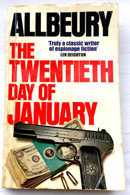
In his Theory of Everything podcast recently, Benjamen Walker reveals the 1981 novel 'The Twentieth Day of January' and makes a number of startling claims:

  • It describes an East Coast outsider populist who becomes US president

  • The Soviets blackmail the candidate with clandestine photos

  • They also influence the election (in the novel!)

  • Trump has been promoting rapprochement with Russia since he befriended a KGB agent in the 1980s

  • He has been telling people for years it's his favourite thriller


This week I shall be supporting our librarian in a session with High School teachers on research skills. We want to help them to model critical thinking skills for their students. I plan to play to the teachers a short extract of Walker's podcast and challenge them to investigate the facts (particularly: has the president really read the book?). We will ask them to tell us how they would go about verifying the claims and share with them SDSU's advice ("Are any conclusions offered? If so, based on what evidence?"... "What are the perspectives, opinions, assumptions and biases?"). I do not know the answers, but I am reading the book.

You may be familiar with the hoax websites Tree Octopus and Mankato beloved of information literacy teachers down the years. I don't think we need them any more to illustrate that not everything online is what it seems.

VISUAL LITERACY

During the Christmas vacation, as suggested in an earlier blogpost, I disconnected myself from the Internet. One of the effects was that I read more books than I would have. I am back online now, but I have learned that to be happiest I need to push the digital world a little further away from me. My solution is that my devices spend most of their time on my work desk while in our living room I read paper books and magazines.

[caption id="attachment_127" align="alignright" width="207"]confiscated Could you be a bit more tech-positive? Image by SW[/caption]

I am not alone in my conclusion that one must strive for a healthy balance between the digital and analogue worlds. Last week I spotted a number of posters around the corridors of our school (example on the right). I don't know who, students or teachers, put them up but they don't reflect an official school policy. In any case, it is not a message that I think will promote responsible use of technology.

"Noticing the construction of a message helps one become a more critical, questioning reader and viewer" (Hobbs)


Rather than charge in and criticise the posters, however, I feel I can achieve more through the educational process. With my colleague facilitator, I am developing a course for Grade 6 students called 'Get Set' which is designed to prepare them to function well in our 1-to-1 laptop classroom environment. For our next unit, we will discuss how to achieve a healthy approach to screen-time.

We will discuss posters such as this one and consider critically the message it implies. The students will prepare an information campaign. What are the behaviours we desire? Should we instill attitudes by education or coercion? Can we use techniques of visual communication to influence the school community to use technology responsibly?

These literacies are not as new as we might think since, in essence, they boil down to a refusal to take things at face value. Whether we are dealing with intellectual property theft, conspiracy theories or technophobia, the prime need is that we learn to think critically.